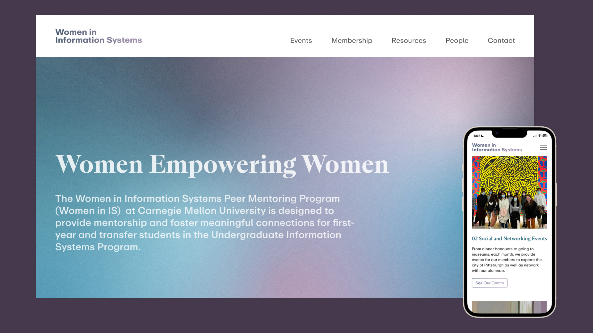
WOMEN IN INFORMATION SYSTEMS ORGANIZATION WEBSITE
TIMEFRAME
5 Weeks, Fall ’21, Spring ’23
TEAM
Nicole Xiang
Michelle Koo
SKILLS
UX Design
Brand Design
User Research
Usability Testing
5 Weeks, Fall ’21, Spring ’23
TEAM
Nicole Xiang
Michelle Koo
SKILLS
UX Design
Brand Design
User Research
Usability Testing
Women in Information Systems (IS) is a program founded in Spring 2020 to provide support, mentorship, and connections for female students in the Undergraduate Information Systems Program at Carnegie Mellon. The program is part of the university’s bigger initiative to boost visibility and support women in STEM.
The organization was, however, having difficulty keeping current mentors and attracting new members. After talking with different stakeholders in the organization, we realized a centralized platform is needed to help the organization reach its current members while also promoting its events with prospective members. We delivered a responsive site and all the design files to the organization advisors.
MY ROLE
As the team’s design lead, I collaborated with the team in designing low-fi wireframes and took full responsibility for designing the mid-fi and hi-fi wireframes as well as prototyping. Besides holding design responsibilities, I also helped conduct 3 user testing interviews, mainly by taking notes or keeping track of the time each user spent on a task.
THE DESIGN CHALLENGE
When surveyed by the program, the majority of female students, making up almost 46% of IS undergrads, want professional and academic mentorship and a way to connect with people who face similar societal challenges. Why is there a disconnect between what the students want and the resources the Women in IS Organization provides?
USER RESEARCH
INTERVIEWING THE STAKEHOLDERSIn order to understand the existing gap, we interviewed 5 representatives from the following groups of our target audience: mentors, prospective members, and IS faculty advisors. We listened about their involvements, painpoints, and goals. We were also very lucky to have Nicole on the team, a current mentor in the organization, who supplemented the interviewees’ insights and led the interview process. Here are hightlights from what the interviewee told us:
ANNIE & SARAH, PROSPECTIVE MEMBERS:
JACKIE YANG, MENTOR:
BRANDY WILSON & CORREY DANDOY, INFORMATION SYSTEMS FACULTY ADVISORS:
Annie and Sarah have heard of the program but are unsure about how to get involved. They want to know exactly what “mentorship” entails. What kind of activities? What kind of events? Who is part of this? What is the process for joining? Does the organization have an actual impact?
JACKIE YANG, MENTOR:
Jackie doesn’t feel a strong sense of community in the organization. She is unclear about her responsiblity as a mentor. She is fustrated that the organization’s events do not get enough attention.
BRANDY WILSON & CORREY DANDOY, INFORMATION SYSTEMS FACULTY ADVISORS:
Brandy and Correy want more people to join the program and utilize the resources offered. They currently use the Women in IS website to provide information and promote the organization and its goals.
REFLECTING ON RESEARCH
& ANALYZING THE PRE-EXISTING SITE
UNDERSTANDING THE STATUS QUOConsidering the pain points of prospective members, current members, and the faculty, we concluded that there are two main factors why most of the students are not taking advantage of the program: 1. Prospective members can’t fully comprehend the resources offered by the program 2. The organization is lacking a sense of community and identity—not enticing to potential mentees or mentors.
When we examined the current website, the main source of information on the program, we realized that the site lacked the draw the IS advisors wanted it to have. The current members and prospective members felt the site was boring and did not illuminate the resources the organization offered.
We recognized that a new site would solve the two existing problems—a centralized platform that would both draw in and inform prospective members and highlight the work of mentors and advisors, making all women in IS feel welcome to the organization.
CURRENT SITE
![]()

SITE ARCHITECTURE
CREATING THE UNDERLYING STRUCTUREAn example of how we structured the new website according to the needs of the skateholders was by having all the key information about the program on the home page, making it easier for prospective members to understand how the organization benefits them. Another example is by including the Events page, which current and prospective members suggested would help them find up-to-date information and also promote the organization’s activities.
SITE MAP
![]()

LOW-FI WIREFRAMES
VISUALIZING THE CONCEPTAs a group, we worked quickly together to translated our site architecture into low-fi wireframes. In our design, we wanted to create space that allowed for the use of pictures, showcasing the community that was missing on the old site. For the Events page, we included a calendar that would help members find all upcoming events for the month.
LOW-FI WIREFRAMES
![]()

USABILITY TESTING 1
KEEPING STAKEHOLDERS IN THE LOOPWe then tested our low-fi wireframes with 4 target users to get feedback on the big-picture structure and layout of the site. The success of our site was judged on the qualitative feedback we got as well as the time it took the testers to complete the tasks we assigned them.
QUESTIONS:
What are your initial reactions to this website page? What strikes you about it, whose site you think it is, what you can do here, and what it’s for? Just look around and do a little narrative. You can scroll if you want to.
What are your initial reactions to this page?
How did you find the experience of completing this task?
Any final thoughts/feedback on the website as a whole?
TASKS:
You would like to preview all upcoming events. Find out where you can view them.
What types of events does the organization host?
Imagine you are a current mentee, and want to become a mentor next semester. Find out where to apply.
Imagine you are a staff member who’d like to get involved with the Women in IS program. Find out the contact information of current advisors so you can email them.
KEY TAKEAWAYS:
The calendar on the Events Page was overwhelming and unnecessary since the organization only hosts 3 events per month.
Some information was hidden like the advisors’ contact information as users had to pass all the mentors’ bios before reaching those. There were also too many sections on the home page.
Some interactions were unclear. Users also got confused if the section under “mentorship events” were links or just texts with images. They also weren’t sure where some of the buttons would take them.
Wordings of sections created confusion. There was a misunderstanding between “Meet Us” and “Contact” pages.
Read the full report here.
TIME SPENT ON TASKS
![]()

MID-FI WIREFRAMES
CONTINUING ON THE ITERATIVE PROCESSBefore working on the design, I revisited the site architecture since the user testing session illuminated a better way for us to arrange information.
NEW SITE MAP
![]()
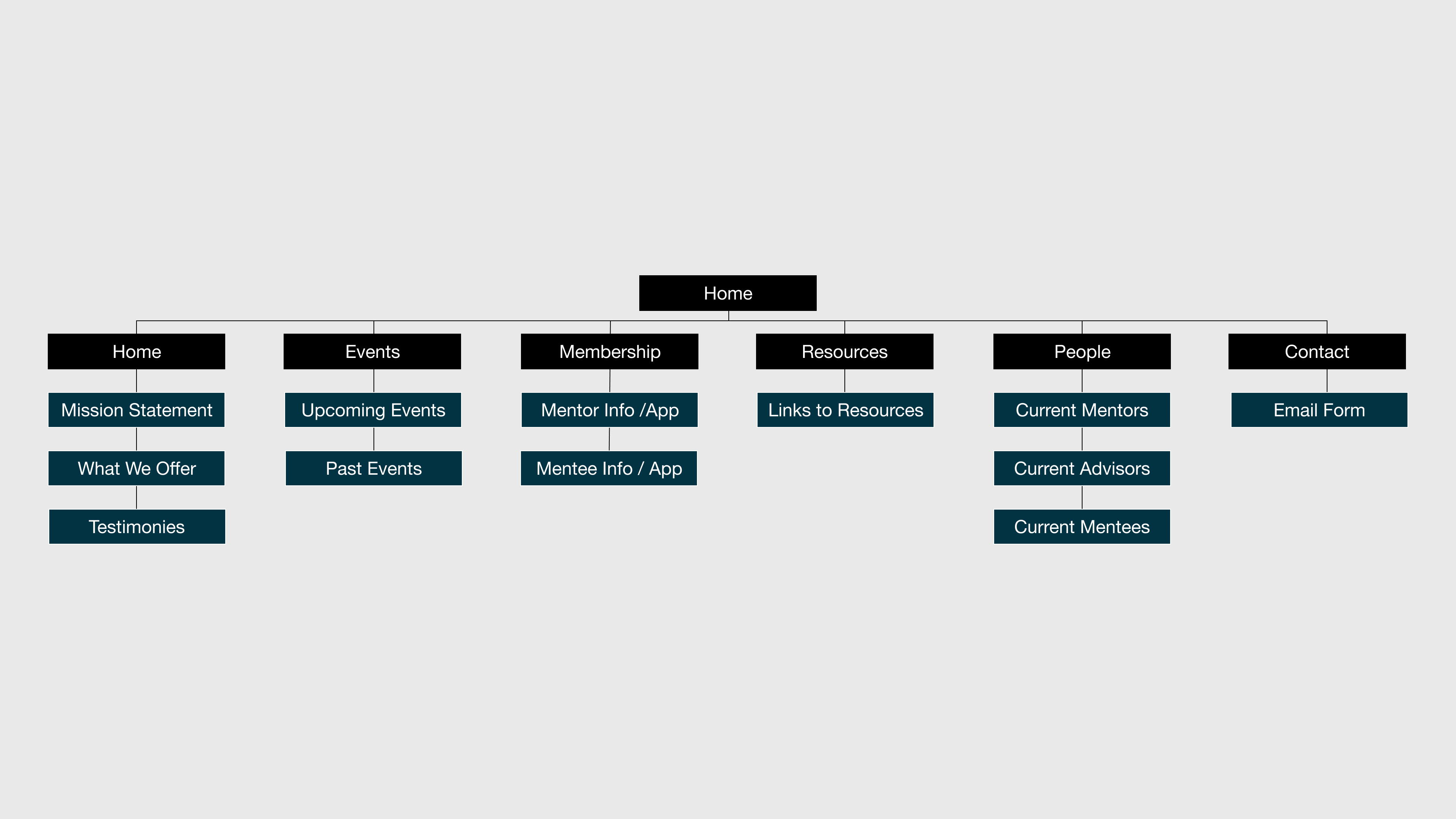
I restructed the home page; even though all the information on the home page was important, putting them all together reduced the user’s ability to focus on one, making all of them less effective. I also added a Resources page to better showcase the resources the organization offers, a direct feedback from the users. Renaming each page also created more clarity for navigation.
MID-FI WIREFRAMES
![]()

HOME
![]()
01.

01.
Restructuring the “What We Offer” section of the home page allowed interested students to understand the organization in a glimpse. Buttons, linking to more in-depth pages, gave the option for students to dive deeper into each topic.
EVENTS
![]()
02.

02.
Removing the calendar allowed more space for highlighting upcoming events. A “sign up” button directed students to a Google form, making it easy for members and prospective members to join events.
PEOPLE
![]()
03.
03.
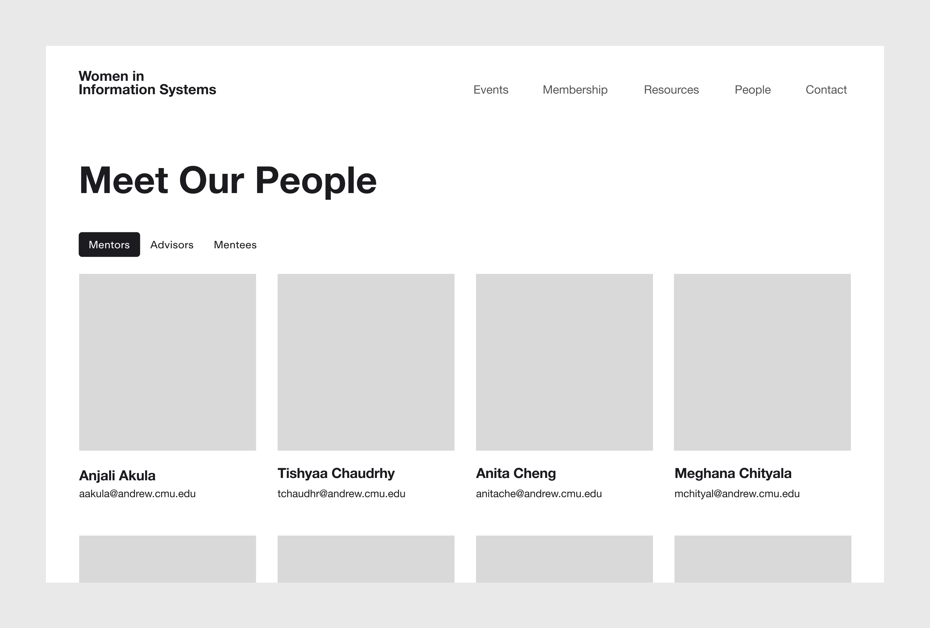
Tabs helped users find information on mentors, advisors, and mentees faster than the previous design.
RESOURCES
![]()
04.

04.
A new Resources page gave a comprehensive view of all the resources provided by the organization.
CONTACT
![]()
05.The blurb on each page, next to the call-to-action, provided additional context and clarify for what information exists on each page, without having to scroll through the page.

05.
The blurb on each page, next to the call-to-action, provided additional context and clarify for what information exists on each page, without having to scroll through the page.
FINAL DESIGN
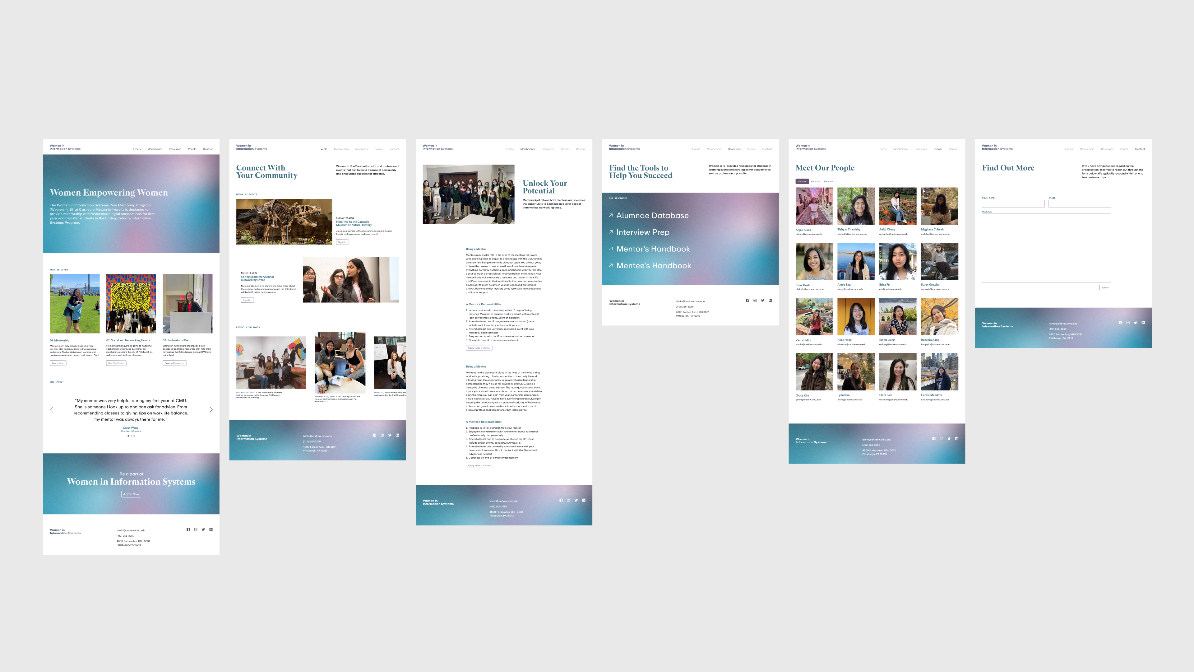
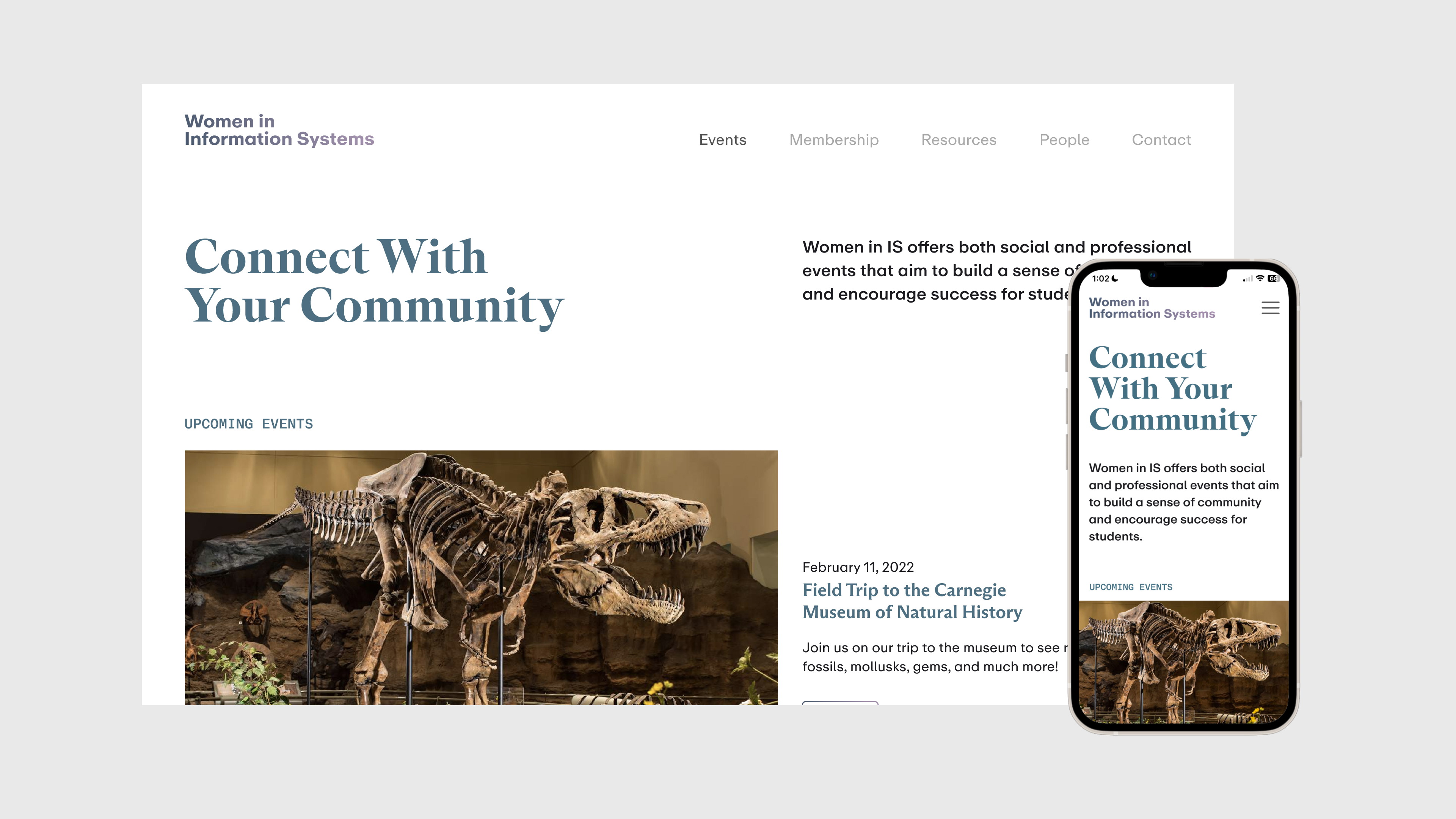
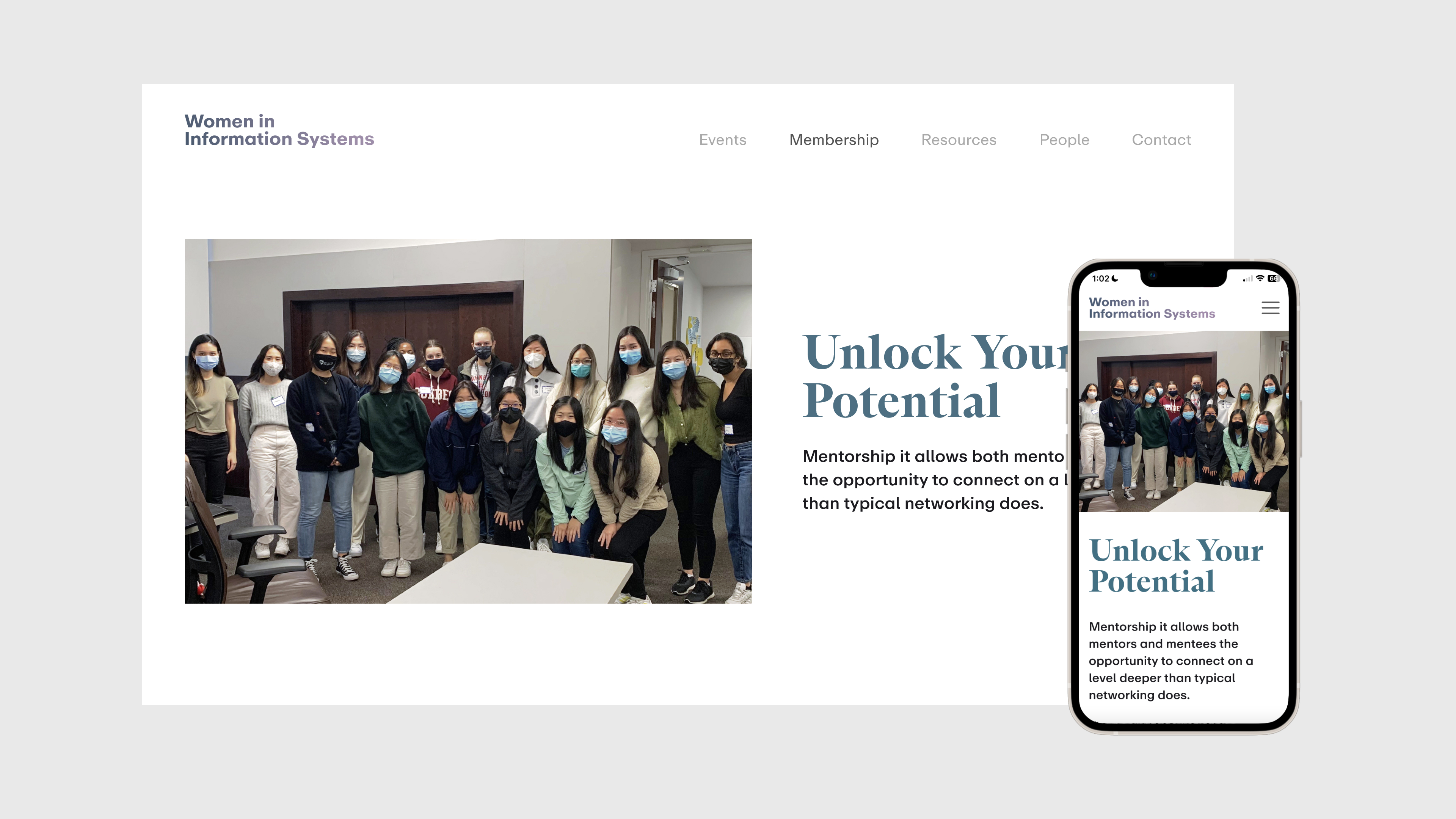
COMING TO FRUITIONAfter another of gathering feedback, which included minor adjustments to wordings and content, I started working on the final design of the website, focusing on type and color.
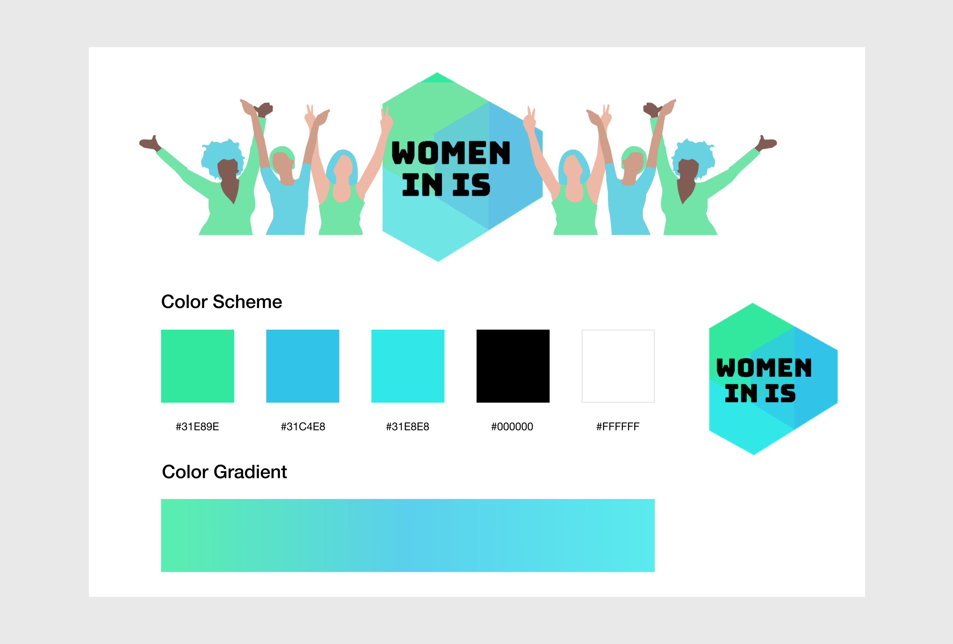
During this process, the Women in IS advisors shared with me the elements that make up the Women in IS Organization’s visual language. Seeing what they shared, I believed that the identity could be freshened to reflect the ambitions and the goals of the organization better.
POTENTIAL AREAS FOR IMPROVEMENT
There is a visual imbalance in the logo. The text is center-aligned, yet it is left-aligned in the shape that encompasses it. The overlapping shapes create too much complexity for a logo.
Illustrations feel generic; they don’t represent the care and the human-connection that the organization strives for.
Colors are too close in hue, saturation, and brightness. Contracting colors will create a more comprehensive, unique, and flexible color system.
Ultimatelty, addessing these issues will help the organization feel more welcoming, genuine, and easy to recognized, allowing it to attract more interests.
EXISTING VISUAL LANGUAGE
![]()
COLORS
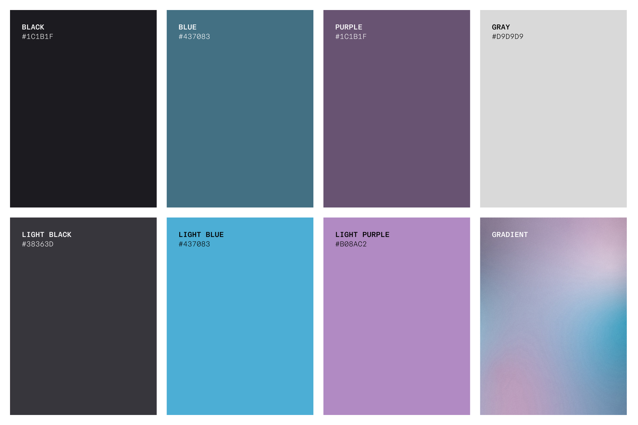
The deep blue and purple colors allude to knowledge and groundedness. The lighter versions of the colors maintain the lively, energetic feelings in the old color system. The gradient brings together the main colors in the palette and provides a sense of optimism and freshness. The new color system represents the organization and its mission to provide female IS students with knowledge and friendship, balancing between academics and leisure.
NEW LOGO
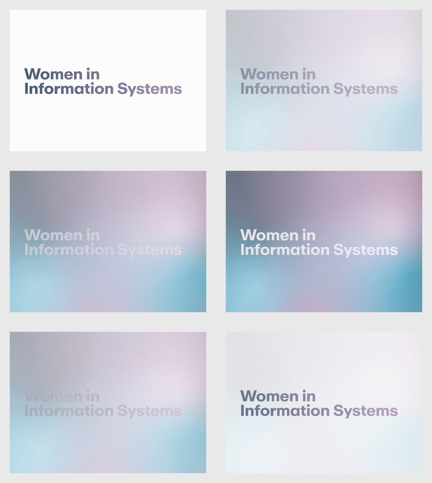
The new logo embraces clarity and brings a professional look to the organization, characteristions that were missing from the old logo.
TYPOGRAPHY
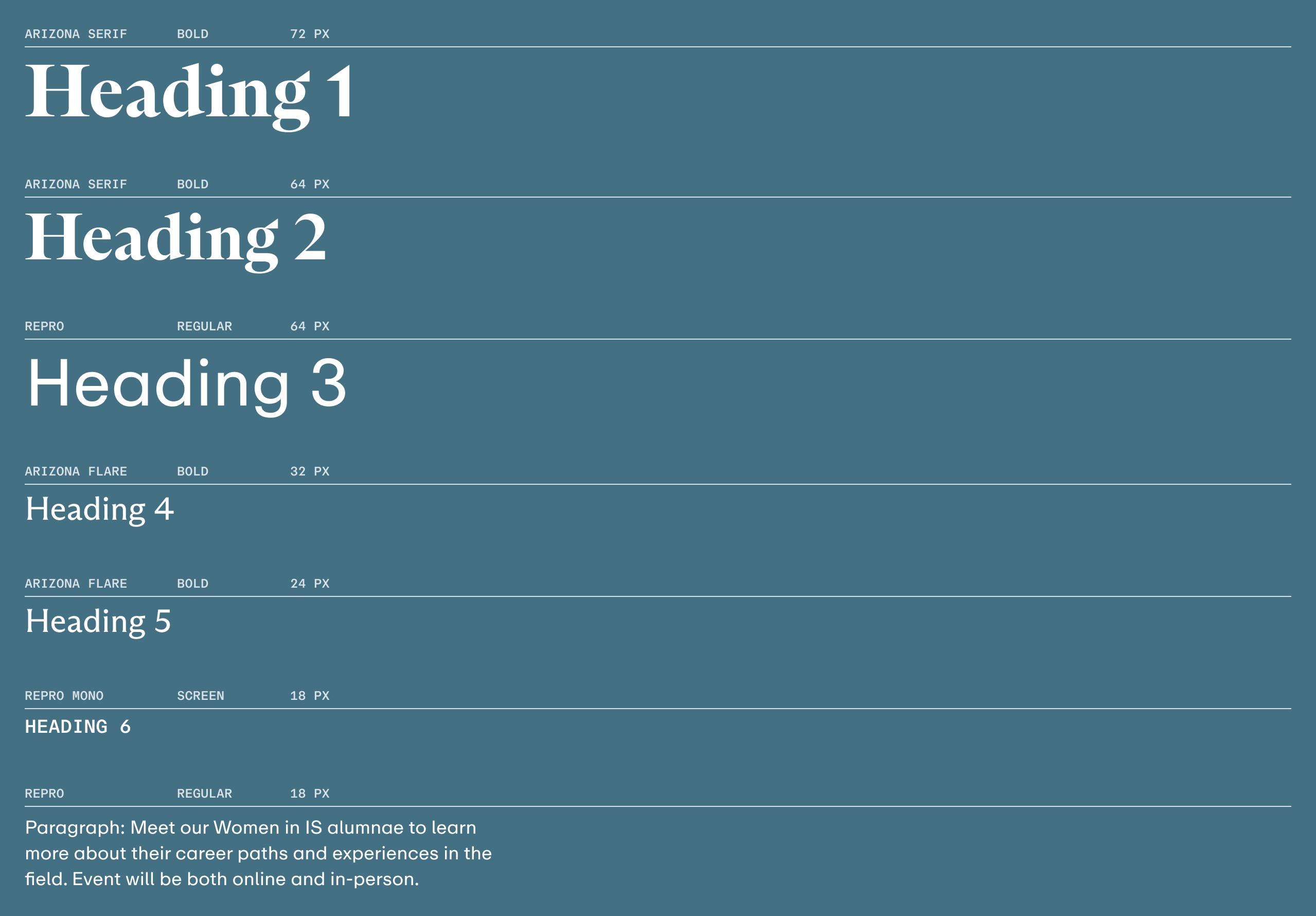
An expansive type system allows for flexibility and better visual hierarchy. Overall, the type system tries to balance elegance and utility. The bigger headings use a serif type that brings sophistication and flare while the smaller headings and paragraph use a sans-serif and mono type, bringing approachability and practicality. This balance within a rich and robust type system, similar to the color system, reflects the organization’s balance between academics, professionalism, and fun.
FINAL DESIGN
![]()



RELFECTION
TAKEAWAYS FROM THE PROJECTThrough this project, I was able to practice my design skills as well as further my knowledge on different reserach methods. I am glad that I was able to translate research insights into design.

EMAIL FROM ONE OF THE STAKEHOLDERS WE WORKED WITH :)
PROJECT LEARNINGS
The design process is definitely not linear! This revelation came about after the first user testing session when our team realized that we needed to revisit the site architecture, which we thought we already made a good decision on—based on the stakeholders’ interview. I learned to embrace change and understand design as an ongoing process for improvement and exploration.
Although our group received positive feedback from the stakeholders we interacted with on the final design, I would love to establish a better metric to measure the success of the project. I wonder how the rest of the female students in IS would react to this project. I’d love to coordinate with the organization to send out a Google survey, gauging how the whole female student body in IS feels about the design. The survey would include a link to the prototype and an instruction on how to interact with it. It would also include questions uncovering the efficiency, learnability, and satisfaction of the site. This would also be a wonderful way to promote the organization.