
MASSIMO VIGNELLI’S WORK & LIFE PART 1
TIMEFRAME
4 Weeks, Spring ’21
SKILLS
Figma
HTML
CSS
Writing
4 Weeks, Spring ’21
SKILLS
Figma
HTML
CSS
Writing
Massimo Vignelli was one of the most influencial modernist designers from the 20th century. His acknowledgment of history while pushing for more modernist visual language allowed him to create work that was new and bold, but respectful to his clients—and to the greater public—radically changing the field of design. His philosophy of intentional, ordinary, yet elegant design has impacted my design work tremendously.
To commemorate his work and understand the history of design, I researched and wrote a 1500-word article on his life and work. Optimining today’s technoIogy for a more robust storytelling experience and to appeal to present-day audience, I focused on two media—a mobile-focused experience and a website–that would futher bring the article to life.
THE MOBILE EXPERIENCE
The mobile experience is an investigation into how leveraging mobile-specific affordances can bring Massimo’s story to life. Ultimately, this means a more engaging and informative reading experience for any audience.
RESEARCH
FINDING APPROPRIATENESSMassimo believed that in order to create the appropriate design solution for a problem, one must search and understand the root and context of that problem. Embracing this idea, I started by looking at how written content is currently being consumed in the mobile world.
From this examination, I learned that the default interaction is the vertical scroll. When combined with on-screen animation, it can really highlight certain information without overwhelming users (screen 2). The secondary interaction seems to be the horizontal scroll. When it is used, there has to be some sort of indication like pagination dots (screen 3) or having content a little off the frame (screen 1). Tapping is also useful for enabling the overlay of information on the screen. Similar to horizontal scroll, there has to be a clear indication that certain elements could be tapped. This can be accomplished through the contrast in color, weight, or shape (screen1).
From Left to Right:
Women’s Pockets Are Inferior (The Pudding)
Brooklyn’s Street Address Mess (The New York Times)
The Atlantic’s Instagram
Women’s Pockets Are Inferior (The Pudding)
Brooklyn’s Street Address Mess (The New York Times)
The Atlantic’s Instagram
SITE ARCHITECTURE
A STRUCTURE THAT EMBODIES INTELLECTUAL ELEGANCEAccording to Massimo, all good creations—both artistic and scientific—stem from intellectual elegance. Intellectual elegance is the essence of design—the thinking behind all well-designed creations. To make this project the best it can be, I have to think through the structure of the mobile experience. I decided to divide my content into 4 sections—Life, Timeline, Work, and Philosophy—with navigation that would allow people to jump from section to section. Breaking content into chunks will allow people to take in the information better.

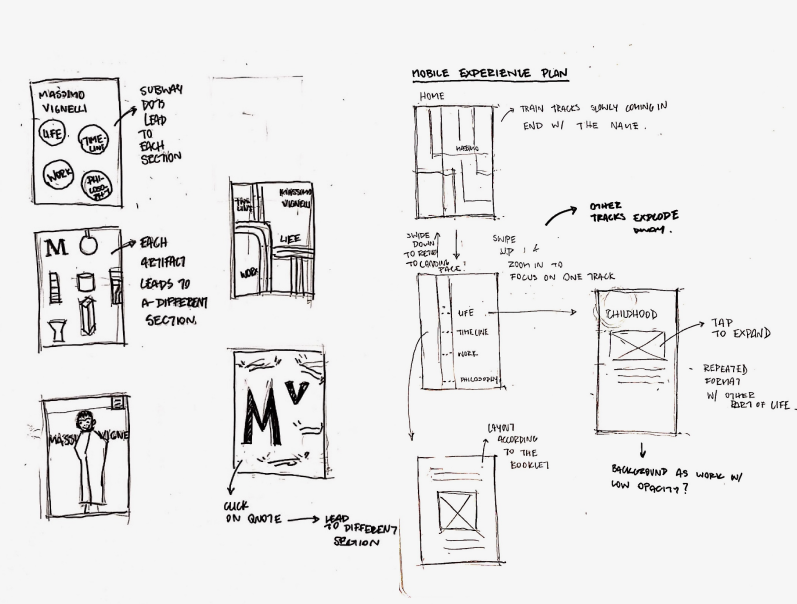
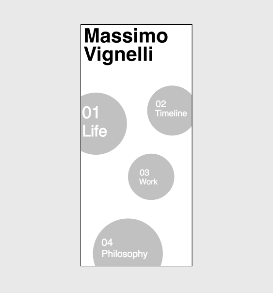
SKETCHES & LO-FI WIREFRAMES
FROM THOUGHT TO VISUALWith a direction in mind, I sketched and made low-fi wireframes. Below is how the 4 sections and the home page navigation could look. I then seeked out feedback from 3 potential users to help improve the design. Overall, users found the design to be easy to navigate. However, more time has to be spent on the layout of each page to improve readability and engagement. I also wanted to introduce more varied interactions to the experience.

SECOND ITERATIONS
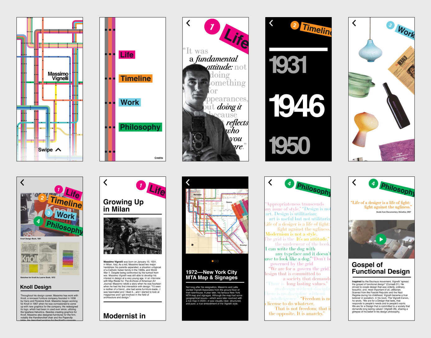
IMPROVING VISUAL HIERARCHYFor this round of iterations, I focused on the visual aspect of the experience. I incorporated more elements—colors and type treatment—from Massimo’s work to the project. Since the subway map speaks to the idea of navigation, I decided to use elements from it for the drop-down navigation.

FINAL REFINEMENTS
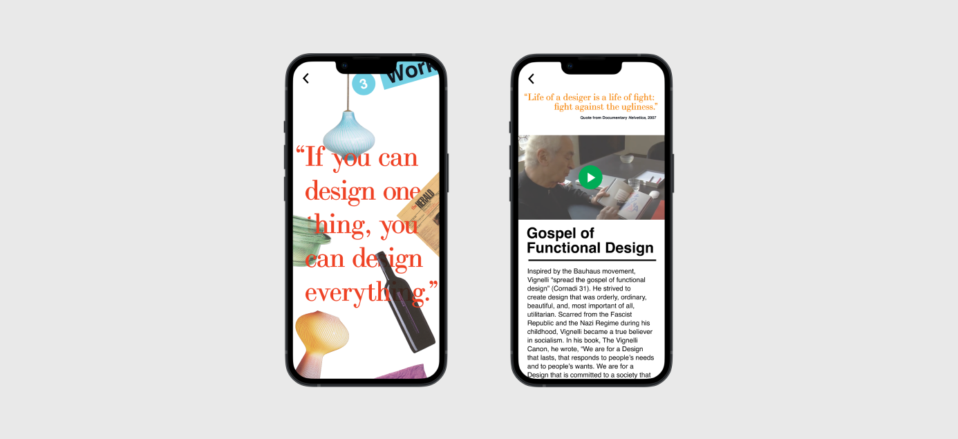
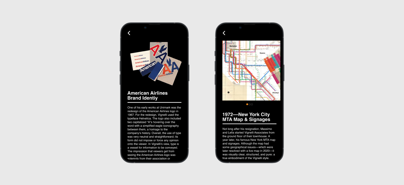
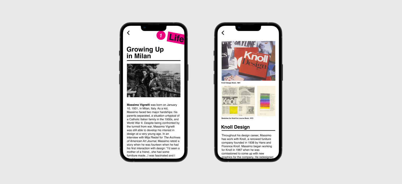
PUTTING THE EXPERIENCE TOGETHERWith the visuals and interactions being almost finalized from another round of feedback, I now focused on refinement. For prototyping, I tweaked animated details to create a more satisfying motion on the screen. As for the graphic elements, I increased body copy size and leading to increase readability and changed the sizes and shapes of buttons to accommodate the tap interaction better. Some of the final changes can be seen in the screens below.
THE WEB EXPERIENCE
Given less time than the mobile experience and the constraint of having to code a fully functional site, the web experience not only serves to convey Massimo’s story in an approachable and compelling way but also as an exercise in learning the basics of web development.
SITE ARCHITECTURE
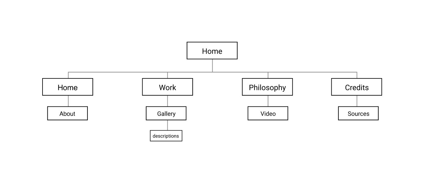
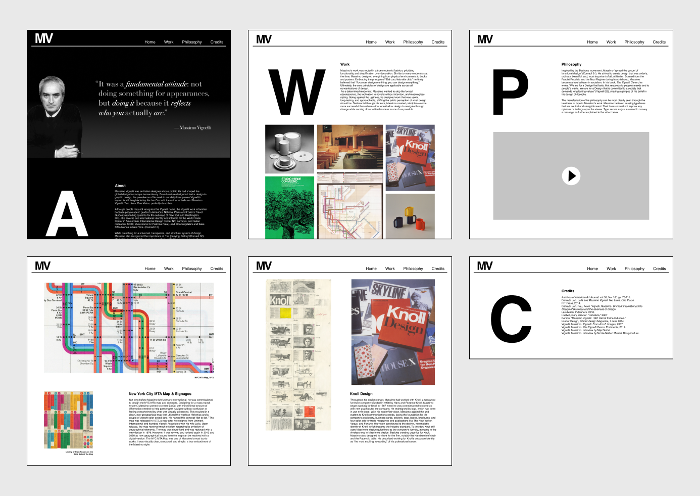
EMBRACING SIMPLICITYLike the mobile experience, I followed a similar site architecture. However, since I had to code a fully responsive website, I needed to reprioritize and reduce certain information to accommodate technological feasibility. I decided to have only three main sections. The home page includes information about Massimo’s life. The work page lets users read in-depth about Massimo’s most well-known projects. Lastly, the philosophy page explains Massimo’s work and life philosophies. Ultimately, this structure would allow me to represent the totality of Massimo’s life concisely while enabling enough flexibility in each page to create engaging layouts.
WIREFRAMES
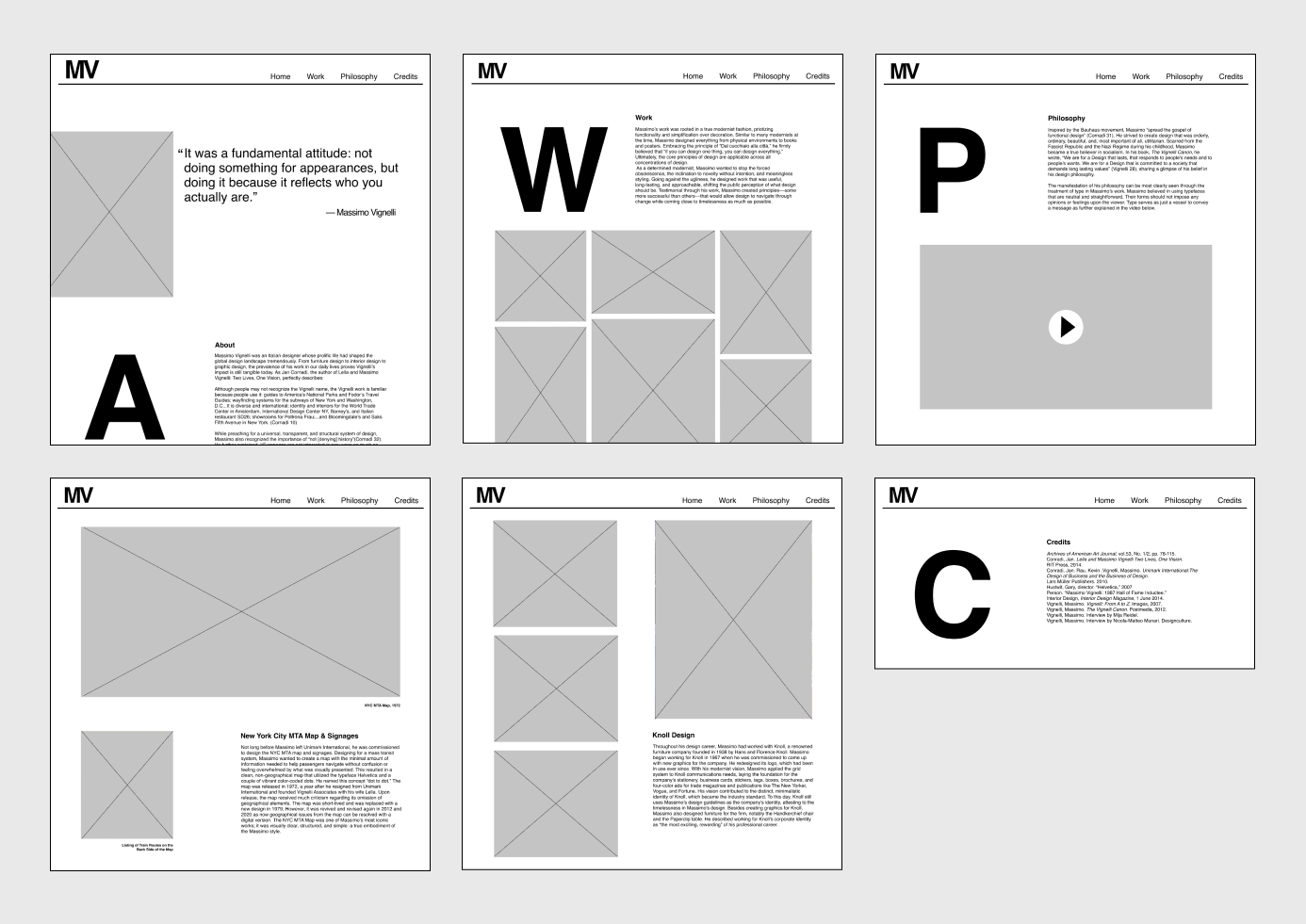
CREATING VISUAL VARIETYWith the site architecture finalized, I started making wireframes. In some of Massimo’s print work, he used big caps as indications for the specific section a reader is on. I wanted to apply this concept to my work as a homage to Massimo. I utilized a 12-column grid since this would make the design easier for implementation during the coding phase. After a couple of tweaks, the wireframes can be seen below.
IMPLEMENTATION
FROM IDEA TO REALITYI recreated the same column structure using sections in HTML and added style and media query under CSS to make the site visually appealing and responsive.
