KY: REIMAGINING THE TRAVELING EXPERIENCE WITH CONVERSATIONAL UI
TIMEFRAME
4 Weeks, Spring ’22
TEAM
Caitlyn Baensch
Dorothy Li
Elena Crites
SKILLS
Figma
After Effects
4 Weeks, Spring ’22
TEAM
Caitlyn Baensch
Dorothy Li
Elena Crites
SKILLS
Figma
After Effects
From booking a flight, to finding a place to stay, to looking for activities to do, Kayak—a US based travel site—is a one-stop shop for all travel needs. Currently, Kayak attracts more than 46 million users through its website and mobile application each month. With its continual growth, the company recently started exploring opportunities beyond being a travel information platform with features like luggage measurement and flight tracking.
Seeing new opportunities in trip preparation and on-the-go assistance for Kayak, we wanted to design mobile features that further alleviate problems many travelers experienced. We mainly explore features using conversational UI (CUI), imagining if communicating with a computer in human terms would give more agency to travelers and, ultimately, make their trips more pleasurable.
MY ROLE
I was mainly responsible for developing and prototyping 2 CUI state and 1 CUI feature. For our final concept video, I illustrated 3 scenes and created the audio. I also wrote part of the script for the video and helped came up with concepts and early wireframes for 2 other CUI features.


THE DESIGN CHALLENGE
Travel experiences of all sorts are often overshadowed by the stress that comes with planning, packing, and adapting to unforseeable events—flight delays, bad weather, getting lost, we all have faced it to some degree. How might we help travelers enjoy their trips better regardless of unexpected circumstances?
RESEARCH
UNDERSTANDING THE STATUS QUOTo understand what issues currently exist, we interviewed 5 travelers ranging from college students to sone-to-be retirees—both current and potential Kayak users—about their traveler processes. From then, we created a user journey map, which helped us identify key interactions, emotions, goals, and pain points within the traveling experience based on the interview insignts seen below. The map also showed us where a design intervention could be helpful.

FEATURE BRAINSTORM
IMAGINING THE POSSIBLITIESNext, we brainstormed potential features based on the understanding of the user journey map. This ideation phase was also informed by the recognition of current AI capabilities, which we want to leverage. We considered how the data that drives our features—whether through other applications or through Kayak itself—can be collected and what inferences can a computational system make from the data.

CHOSEN FEAUTURES
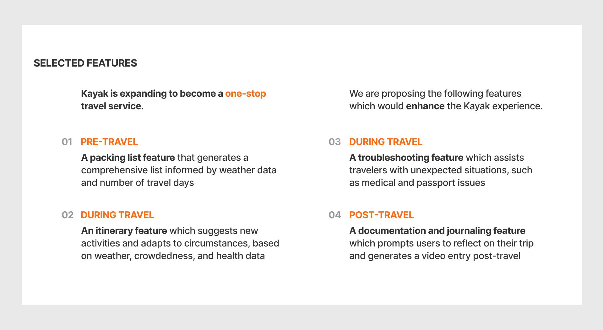
DEFINING OUR SCOPEHaving an array of options to choose from, we based judgment on 2 criteria: 1. How valuable each feature would be to a customer 2. How often would a customer use a certain feature. From this these criteria, we then decided on the 4 features we would focus on.

EARLY CUI MOTION EXPLORATION
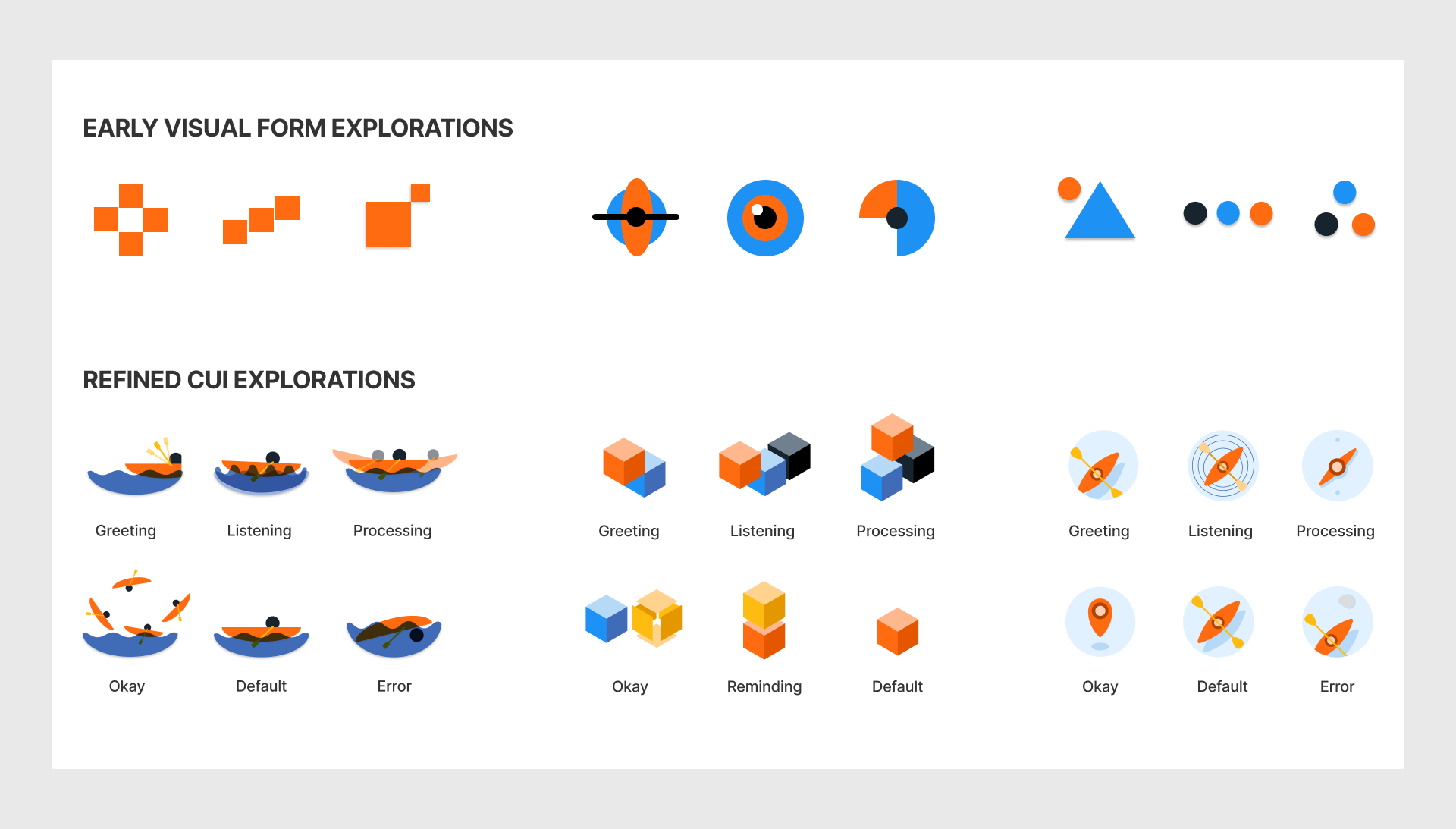
CLARITY IN MOVEMENT FOR COMMUNICATIONWith the features finalized, we started thinking about what visual states are needed to facilitate conversations between the user and our conversational user interface (CUI). First, we began by brainstorming necessary communicative states. We then individually move on to generate motion exercises that represent the states we identified in the step before. We later mapped our explorations along axes of negative to positive and low urgency to high urgency. This helped us compare our initial prototypes and inform what direction to go in.
CUI VISUAL EXPLORATION
COMMUNICATIVE AND ON BRANDOur early CUI explorations adhered closely to the existing brand and used mainly simple shapes. Based on feedback, we decided to explore other directions that were more complex to allow for a more dynamic form yet still cohesive with the brand. After collecting more feedback, the group landed on the overhead kayak visual as it represented the brand well and gave us the right amount of flexibility to convey various states. We also named our CUI “Ky” since this was very fitting with the company’s name.


FINAL CUI STATES
MARRYING FORM AND MOTIONOur final CUI states combined the knowledge we gained from our motion and visual explorations. We explored ways that Ky would move with the goal of making motion cohesive with form and identity; we intended to make Ky’s motion fluid and energetic.
CUI SCREEN WIREFRAMES
CONSIDERING DIFFERENT MODES OF INTERACTIONSThe next step was to design screens where Ky would exist based on our chosen features. Our low-fi wireframes were focused on supplementing the main interaction of talking to Ky. As we designed our screen, we considered what information would be best conveyed visually or conversationally.

FINAL CUI SCREENS
CREATING AN ENGAGING EXPEREINCEWe then refined our screen improving readability and visual hierarchy with tweaks in composition, type sizes, and colors. Having the finalized wireframes, we moved to prototyping the interactions.

THE CONCEPT VIDEO
As designers, we are always challenged to communicate our ideas through “showing” not “telling.” The video is a powerful way to do so: to walk the audience through a scenario with a single through line that illustrate various facets of the concept.
STORYBOARDING
BUILDING THE BACKBONE OF A COMPELLING VIDEOTo create an impactful video, we wanted to include the most important points in our concept—highlighting the main pain points, bringing to life our user journey, and showing CUI screen prototypes. With our script and recording done, we explored different visuals that could accompany the audio, thinking about camera angles and transitions. We discussed our storyboarding sketches before finalizing on a direction.

TYPOGRAPHY & COLORS
MAINTAINING BRAND COHESIONAs we worked on our video, we kept in mind the Kayak brand. We made sure that our typography and colors conveyed the Kayak's identity. The usage of minimal colors also allowed viewers to really focus on the content of your video rather than being distracted by the superfluous.

ILLUSTRATING & ANIMATING
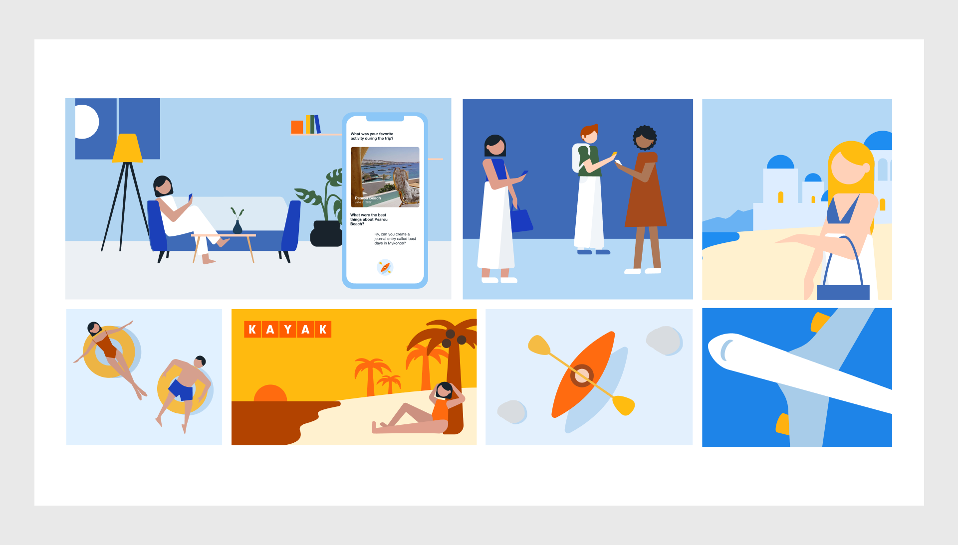
PUTTING THE PIECES TOGETHER We illustrated our main scenes before animating them. Throughout this process, we experimented with different levels of abstraction. With a couple of iterations, we were able to create simplified, yet communicative shapes.
